

Project overview
remedi is here to revolutionize your healthcare journey with its innovative ecosystem, becoming your gateway to effortless scheduling and comprehensive record-keeping. Our platform places the control of your well-being into your own hands.
As visual and branding lead, I worked on creating a brand identity and design system, as well as monitoring visual consistency throughout our product ecosystem. I also helped with mobile interface design, user research, and user testing.
There is a communication gap between patients and doctors
Patients experience confusion and discomfort due to a lack of understanding and miscommunication between them and their healthcare providers.
Sometimes patients are overwhelmed by the complex medical terms when treatment plans and instructions are not clear, leaving them feeling unheard and frustrated with their doctor.


The solution
Summarizing and transcribing medical appointments for easy access
Collecting user insights
We received a total of 34 survey responses, including 21 from patients and 13 from the medical workers.
We also collected written diary studies where we had 5 patients record their appointment experience and 6 medical workers record their documentation experience. This is what some of our participants said.
"I don’t want to take up the doctor’s time so sometimes things that concern me aren’t being discussed." - Patient
"There's also so much down time just clicking through tabs, and nothing is placed conveniently." - OB/GYN Employee

Affinitizing our data and identifying pain points
Compiling our research and organizing them into groups based on their similarities, we pinpointed 3 distinct opportunity areas.

1
A lack of transparency between patient and doctor
Patients often felt they weren't able to properly address their health concerns to their provider during an appointment in a timely manner.
2
Manual filing and documentation is time-consuming
Medical workers find that the process of organizing patient charts to be non-intuitive and difficult to navigate.
3
Limited access to health records
Patients want their medical information to be easily accessible after an appointment.
How might we…
From all the research we gathered, we asked ourselves the question: how might we improve communication between doctors and patients to ensure patient understanding of their own health while providing a seamless documentation structure?
Visualizing our concept
We wanted to create a cohesive product ecosystem that would be used for patients and for medical workers. We decided to design a mobile platform where patients could view more information about their appointment and treatment plans, as well as actively transcribe their appointment.
The app would pair to a pin worn by the doctor that would be recording the audio during the appointment and transfer that data to the patient app as well as the plugin for medical documentation.

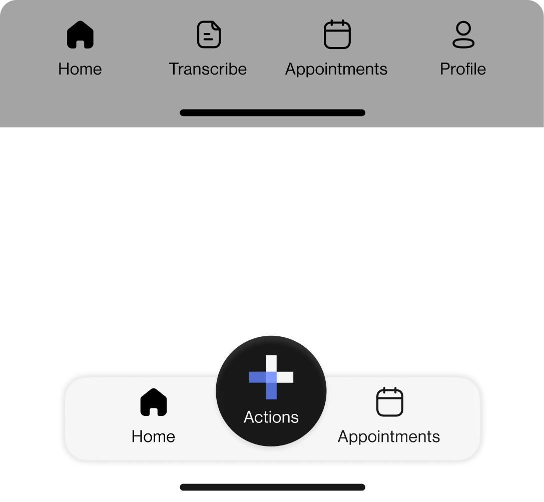
App Prototype

Plugin Prototype

Pin 3D Model
Testing our design
We tested 9 different users and conducted 2 rounds of testing, giving them different tasks to complete while testing the usability of our app.
From this, we were able to identify key areas for improvement.


Style guide
We established a clear style guide to follow to ensure a unified and consistent experience throughout our product ecosystem.

Final design


Project takeaways
Research drives design
Understanding user needs and pain points can help influence better design decisions.
Maintain a logical structure
Building a structure that follows a mental model enhances the overall usability.
Information is sensitive
When handling sensitive information it is important to comply with existing regulations and protocols.